


One basic feature that is lacking from Gutenberg’s Cover block is setting different images for desktop and mobile.
In this article, we will show two methods to do it: Simple and Advanced.
Simple Method: Custom Style
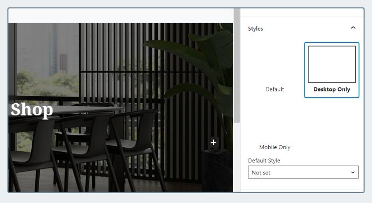
Create two custom styles: “Desktop Only” and “Mobile Only”.
Then create two Cover blocks, each having its respective style. This way you can set different image for the one appearing in Desktop and Mobile.
It’s not pretty, but it works!
Here’s the code to register custom styles and the CSS:
add_action('init', 'my_register_cover_styles');
add_action('wp_enqueue_scripts', 'my_enqueue_cover_assets', 99);

function my_register_cover_styles() {
  register_block_style('core/cover', [
    'name' => 'desktop-only',
    'label' => 'Desktop Only',
  ]);

  register_block_style('core/cover', [
    'name' => 'mobile-only',
    'label' => 'Mobile Only',
  ]);
}

function my_enqueue_cover_assets() {
  $dir = get_stylesheet_directory_uri() . '/css';
  wp_register_style('my-cover', $dir . '/my-cover.css', false);
}
@media (max-width: 768px) {
.wp-block-cover.is-style-desktop-only {
display: none;
}
}
@media (min-width: 767px) {
.wp-block-cover.is-style-mobile-only {
display: none;
}
}Advanced Method: Custom Control
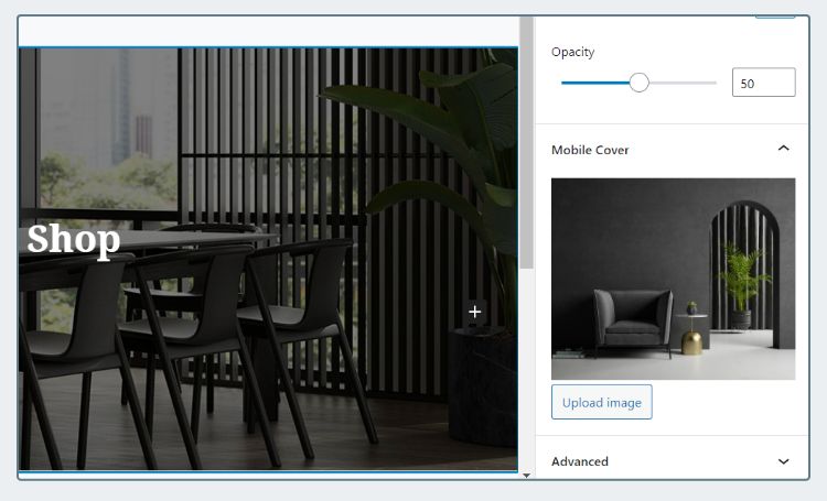
Use JavaScript to add new control into the Cover block as shown above. This looks more professional, although quite complex to implement.
Our goal is to wrap the image in a <picture>. This way, the browser will not load the desktop image on mobile and vice versa.
<!-- BEFORE -->

<div class="wp-block-cover">
  <img class="wp-block-cover__image-background" src="...">
  ...
</div>

<!-- AFTER -->

<div class="wp-block-cover">
  <picture>
    <source srcset="..." media="(max-width:767px)">
    <img class="wp-block-cover__image-background" src="...">
  </picture>
  ...
</div>
STEP 1: The JavaScript
Here we have my-cover.js. We won’t explain the syntax since it’s quite complex. If you want to learn from the basics, check out our Gutenberg Tutorial.
Then, enqueue the script. Change the directory according to your folder structure:
add_action('enqueue_block_editor_assets', 'enqueue_responsive_cover', 100);

function enqueue_responsive_cover() {
  $dir = get_stylesheet_directory_uri() . '/js';
  wp_enqueue_script('my-cover', $dir . '/my-cover.js', [ 'wp-blocks', 'wp-dom' ] , null, true);
}
Now check out the Cover block in Editor. Does the Mobile Upload section show up?
A common mistake is enqueuing the wrong directory. Open the browser’s console to see whether there is a 404 error for the JS file.
STEP 2: Modify Rendering Function
We will filter the rendering method and use Regex to wrap the image in <picture>.
(Update 2023) As of latest WordPress, if you set the Cover to “Fixed Background”, the
<img>will be replaced with<div role="img">. That means we can no longer uses<picture>.The code below has conditional to check that. If using
<div>, it will add extra CSS variable instead of wrapping it in<picture>
add_filter('render_block_core/cover', 'my_responsive_cover_render', 10, 2);

function my_responsive_cover_render($content, $block) {
  // If has mobile image
  if (isset($block['attrs']['mobileImageURL'])) {
    $image = $block['attrs']['mobileImageURL'];

    preg_match('/<div role="img"/', $content, $is_fixed);

    // If fixed background, add CSS variable
    if ($is_fixed) {
      $content = preg_replace(
        '/(<div role="img".+style=".+)(">)/Ui',
        "$1;--mobileImageURL:url({$image});$2",
        $content
      );
    }
    // If not fixed, wrap in <picture>
    else {
      $content = preg_replace(
        '/<img class="wp-block-cover__image.+\/>/Ui',
        "<picture><source srcset='{$image}' media='(max-width:767px)'>$0</picture>",
        $content
      );
    }
  }

  return $content;
}
Then add this in your CSS to replace the background-image on mobile:
@media (max-width:768px) {
  .wp-block-cover__image-background[style*="--mobileImageURL"] {
    background-image: var(--mobileImageURL) !important;
  }
}
Done! Try resizing your browser’s window and you will see the image changing when it reaches the breakpoint.
Note that this setting only affect the frontend. It won’t be applied in the admin editor.
Conclusion
So which method to choose?
If it’s your personal website, using the Simple method is fine.
But for the client website, it will look more professional if you use the Advanced method. It’s easier to edit and less prone to mistakes too.
Let me know if you have any question in the comment below. Thank you for reading.


This is just what I need. I tried the Simple Method but doesn't seem to work. The block only saves one style, either mobile or desktop. Whichever was set last, that's what is used on the page.
I'm not a developer, but I don't see how it would work without changing or adding code to change how the block actually functions. Just adding style options doesn't appear to give the block the ability to save two different images.
Any suggestions, or am I doing something wrong?
Thanks
Hi tony,
The idea of the simple method is having two Cover block, one having Desktop Only and the other having Mobile Only style
Ah yes, that makes perfect sense now. You may want to mention that in the article. Thank you.
Yes, thanks for the input, will revise my article
Hi, my appreciation for your work.
I've been trying for months to implement something similar, but with one substantial difference, I don't want to hide the photo in mobile (or in desktop) with display:none, for the simple fact that the browser anyway loads it and this slows down the page for the user and for pagespeed (small problem in desktop but important in mobile because the hidden photo for desktop can weigh a lot). And so I'm asking if in your opinion it is possible to change the second mode you proposed so that wp_is_mobile is used to make the photo appear in mobile and its negation to make the photo appear in desktop.
Thank you! Regards Harry
Hi Harry, you can do it by using dynamic block, I wrote a guide on this repo: https://github.com/hrsetyono/gutenberg-tutorial/tree/master/06%20-%20dynamic%20block
The way Gutenberg works is saving the HTML generated by
save()method into database. We can override that by addingrender_callbackwhen registering the block.Thanks for the suggestion, I'll give it a try! 🙂
Hi,
To prevent the issue with loading JS, you better use get_stylesheet_directory_uri() insteed of get_template_directory_uri().
Like this you ensure to load the child theme folder if a child theme is used.
Thanks for the fixes. I will revise the post
Very helpful, thanks! Can you publish this as a WordPress plugin? I would want this on all sites that use a cover block.
Hi strarsis,
Currently I have no plan on releasing this as plugin as the publishing to wordpress repo takes a lot of time. But feel free to create your own. Thanks
Hi, First of all thank you very much for this Responsive Cover Block; I managed to implement it very easily thanks to your easy to understand tutorial. Thank you so much. My question is related to Harry's question about the ability to dequeueing the 'desktop' version of the banner image from loading when the site is launched on mobile. Is this possible and how to do this? knowing that I am not a PHP dev despite some notions of integration.
Hope you find time to answer that question. Have a nice day.
Hi Max,
The
<picture>tag only loads the image that is within the breakpoint. I just tested this by opening DevTool, going to Network tab, and refreshing the page. The desktop image isn't loaded in mobile screen.But during the testing I found another bug caused by the new Cover markup in WP 6.2. If you enable "Fixed Background", it changes the
<img>tag to<div>, which mean<picture>won't work. I will find a fix and update the article accordingly.wish this worked but just doesnt do anything for me 🙁
Hi Adrian, the HTML markup of Gallery block has changed quite a bit since I wrote the guide. So this guide might not be valid anymore. I'll try finding time to update it
Thanks for the code. It worked great except for not being able to clear the mobile image. I edited the code to add that feature.
Thank you for your addition, this makes the feature more flexible and easier to use.