


Dark Mode has risen in popularity in the past few years. But developing it is quite difficult. Especially if the website isn’t using CSS Variable.
In this article, we will take a look at a quick and easy way of creating it.
TABLE OF CONTENTS
How It Works
The CSS below will do most of the heavy-lifting:
body.is-dark {
  filter: invert(100%) hue-rotate(180deg);
}

body.is-dark img {
  filter: invert(100%) hue-rotate(180deg) brightness(1.2);
}

/* Images that you want to stay inverted, change it accordingly */
body.is-dark .site-logo,
body.is-dark .icon {
  filter: none;
}

/* All wrapping elements need to have background color */
body,
.main-container {
  background-color: white;
}
We basically inverted everything. So a white background becomes black, black texts become white, and a blue button becomes dark blue.
After that, we reverted back the images so they don’t look like a negative film while slightly reducing their brightness.
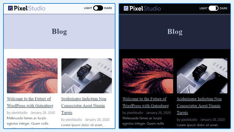
Here’s the demo, click the toggle at the top-right corner:
Now that we know how the dark mode works, we need to decide whether you want (1) automatic detection or (2) manual toggle.
Method #1 – Automatic Detection
(Without JavaScript)
This method uses a media query that checks your device’s Dark Mode setting. Simply change the CSS above into this:
@media (prefers-color-scheme: dark) {
  body {
    filter: invert(100%) hue-rotate(180deg);
  }

  img {
    filter: invert(100%) hue-rotate(180deg) brightness(1.2);
  }

   /* Images that you want to stay inverted, change it accordingly */
  .site-logo,
  .icon {
    filter: none
  }
}

/* All wrapping elements need to have background color */
body,
.main-container {
  background-color: white;
}
That’s all!
Method #2 – Manual Toggle
(With JavaScript)
HTML
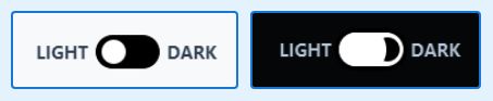
First, we need a toggle. The simplest markup for it is by using Checkbox wrapped in a Label like shown below:
<label class="dark-toggle">
  <span> Light </span>
  <input type="checkbox">
  <div class="dark-toggle__switch" tabindex="0"></div>
  <span> Dark </span>
</label>
CSS
The CSS is quite long, so here’s a link to the Gist. We also provide the Sass version if you prefer that one.
JavaScript
There are 3 things we need to do:
- Change Listener on the Checkbox to toggle dark mode.
- Enter Key Listener on the Checkbox for accessibility.
- Store in a cache so it can automatically change to Dark Mode on load.
Let’s go straight to the code!
const myDarkMode = {
  init() {
    this.changeListener();
    this.tabindexListener();
  },

  /**
   * Change listener for dark mode toggle
   */
  changeListener() {
    const $darkToggles = document.querySelectorAll('.dark-toggle input[type="checkbox"]');
    if ($darkToggles.length <= 0) { return; }

    $darkToggles.forEach(($t) => {
      $t.addEventListener('change', (e) => {
        this.toggle(e.currentTarget.checked);
      });
    });
  },

  /**
   * Keyboard listener for dark mode toggle
   */
  tabindexListener() {
    const $darkSwitches = document.querySelectorAll('.dark-toggle__switch');

    $darkSwitches.forEach(($s) => {
      $s.addEventListener('keyup', (e) => {
        if (e.key === 'Enter' || e.keyCode === 13) {
          const $checkbox = e.currentTarget.closest('.dark-toggle').querySelector('input[type="checkbox"]');
          $checkbox.checked = !$checkbox.checked;
          this.toggle($checkbox.checked);
        }
      });
    });
  },

  /**
   * Toggle the body class and cache the variable
   */
  toggle(isChecked) {
    document.querySelector('body').classList.toggle('is-dark', isChecked);
    localStorage.setItem('darkMode', isChecked);
  },
};

document.addEventListener('DOMContentLoaded', () => {
  myDarkMode.init();
});
The code above stored darkMode variable in localStorage every time we toggle it. But where’s the code to check on load?
Yes, we left that one out because it needs to be the first thing to run. So we have to place it right after opening <body> using hook like this:
add_action('wp_body_open', 'my_add_dark_mode_checker', 5);

function my_add_dark_mode_checker() { ?>
<script>
  (function() {
    const darkMode = localStorage.darkMode === 'true';
    if (darkMode) {
      document.querySelector('body').classList.add('is-dark');

      // activate the toggle
      document.addEventListener('DOMContentLoaded', () => {
        const $toggles = document.querySelectorAll('.dark-toggle input[type="checkbox"]');
        $toggles.forEach(($t) => {
          $t.checked = true;
        });
      });
    }
  })();
</script>
<?php }
Note: Your theme might not have wp_body_open() hook placed.
That’s all!
Fixing AdminBar Bug
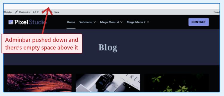
When your body has a filter, the WP Admin Bar is placed incorrectly. Simply add this CSS to fix it:
html[lang]
 {
  margin-top: 0 !important
}

#wpadminbar {
  position: sticky
;
}

/* Revert back the adminbar so it doesn't become White */
body.is-dark #wpadminbar {
  filter: invert(100%) hue-rotate(180deg);
}
Conclusion
Method #1 is much faster to implement. But your visitors won’t know that you have Dark Mode if their device isn’t set on Dark in the first place.
Method #2 is clearer to visitors, but more complex to implement. Personally, I prefer this one.
This method is indeed quick and easy. But it’s a dirty way of creating Dark Mode. The coloring might look off and images looks muted.
If you would like to properly design a dark mode, the Android Dark Theme Guideline is a very good read.
If you have any question regarding Dark Mode, let me know in the comment below


Hello Henner and thanks for this great tutorial on implementing dark mode on wordpress!
Your code works flawlessly and it's one of the best on the topic.
I wish to appeal to you to integrate
window.matchMedia("(prefers-color-scheme: dark)")to the existing code so that the OS dark mode option can also be used if set.
Thanks in advance and warm regards.
Thanks for the information. But isn't this the same way as using the CSS media query to detect the OS's preferences?
Hello and thanks for your response!
Using CSS media query to detect the OS's preferences is not really the same because when that is used in CSS, the user's Dark Mode preference on the site becomes ignored assuming both the CSS and JS versions are combined.
I'm appealing you integrate the JS and CSS code to detect the OS's dark mode preferences but also respect the user dark mode preference on the site in case a user prefers a mode different from that set on the OS.
Thanks for you kind assistance.